encompassing
South
Sector
Location
Work
- Brand strategy
- Visual Identity
- Verbal identity
- Packaging design
- Campaigns
- Brand guidelines
Cassis is much more than a restaurant or a cafeteria, it's a place where you can feel at home away from home. The place where you can feel the South wherever you are. Cassis is the unofficial embassy of the South of Chile; this alive and encompassing South.
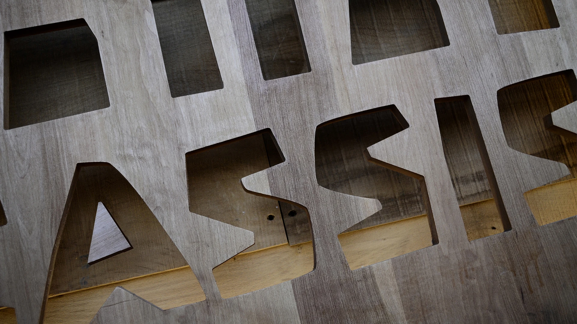
We helped Cassis recognize its brand idea, articulate its successful experience and renew its identity. The logo works both as a metaphor and as a portrait of the place itself and it served us well as a starting point to create and warm and full identity that belongs to the forest and smells like freshly cut wood. Rough, friendly, vivid.
The logo
Based on the brand idea 'Alive and encompassing South', and building on the experience that each restaurant serves as a social meeting point with an ambient created almost entirely from natural wood sourced from trees in their own locations, the logo symbolises precisely a habitat shaped by trees, where form and counterform come together to create that immersive environment.
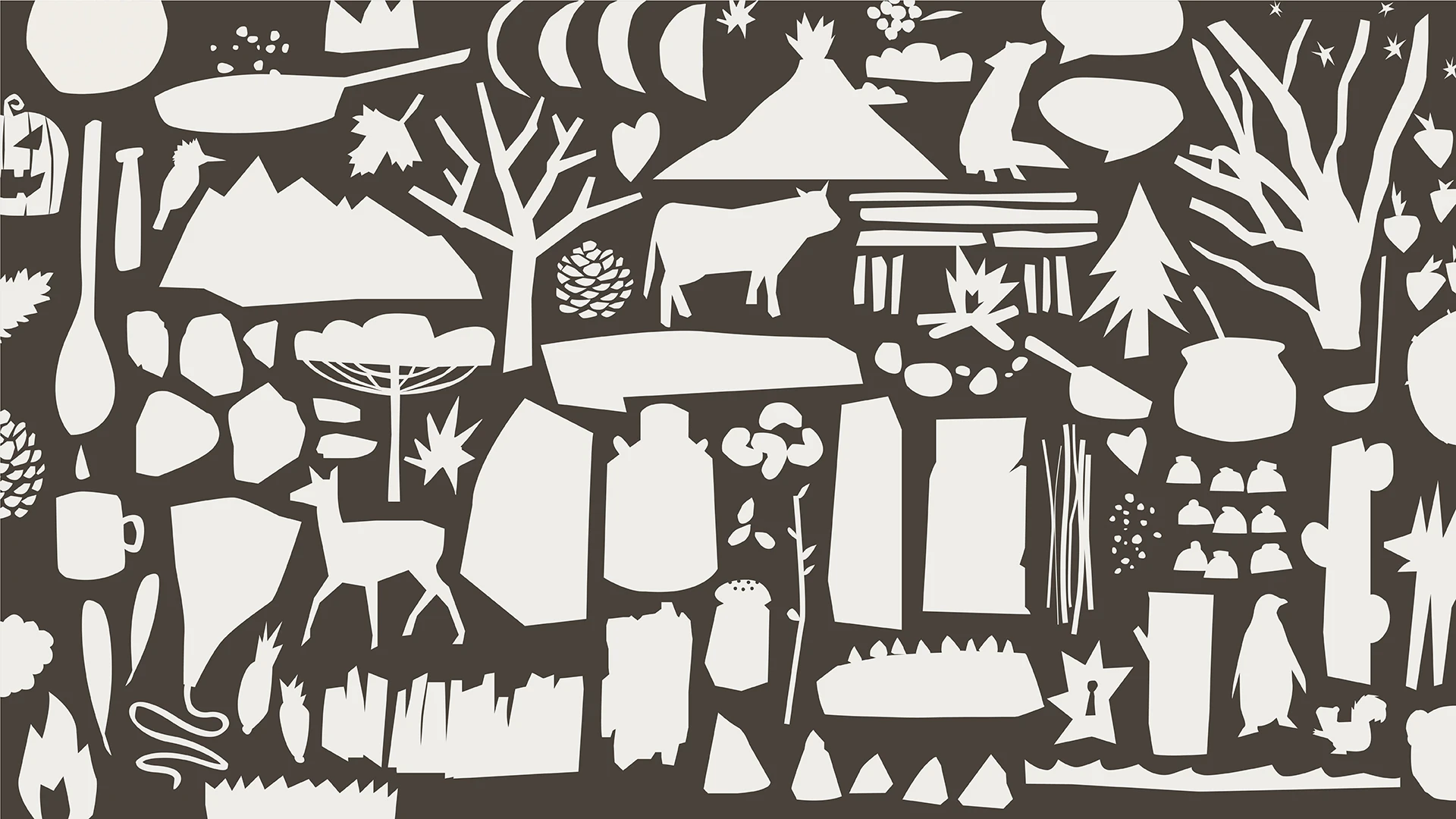
The illustrations
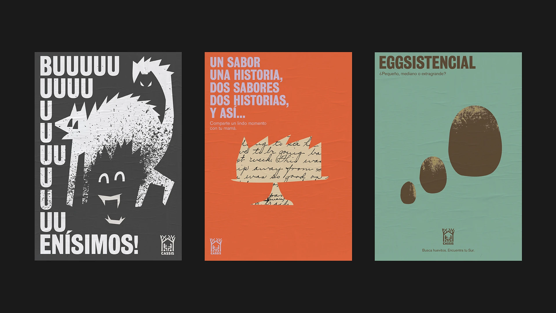
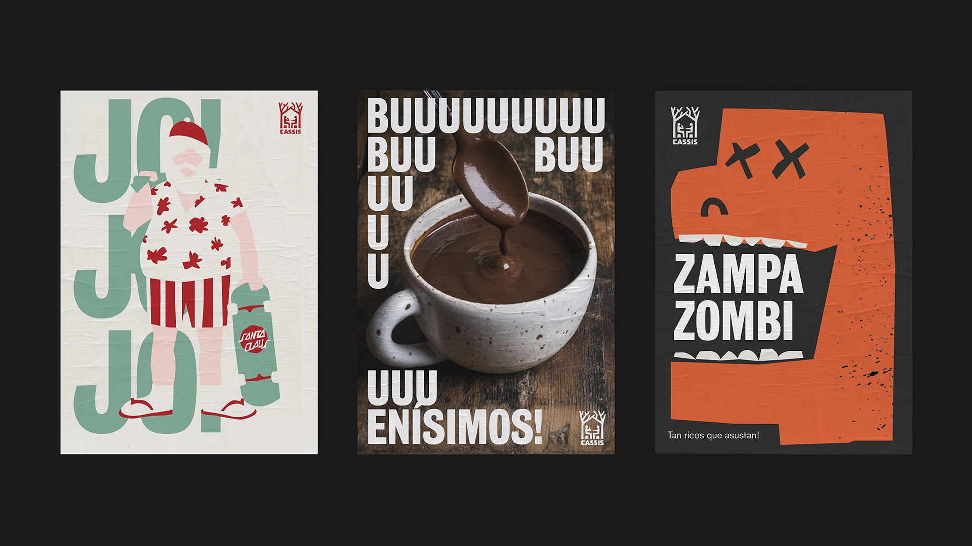
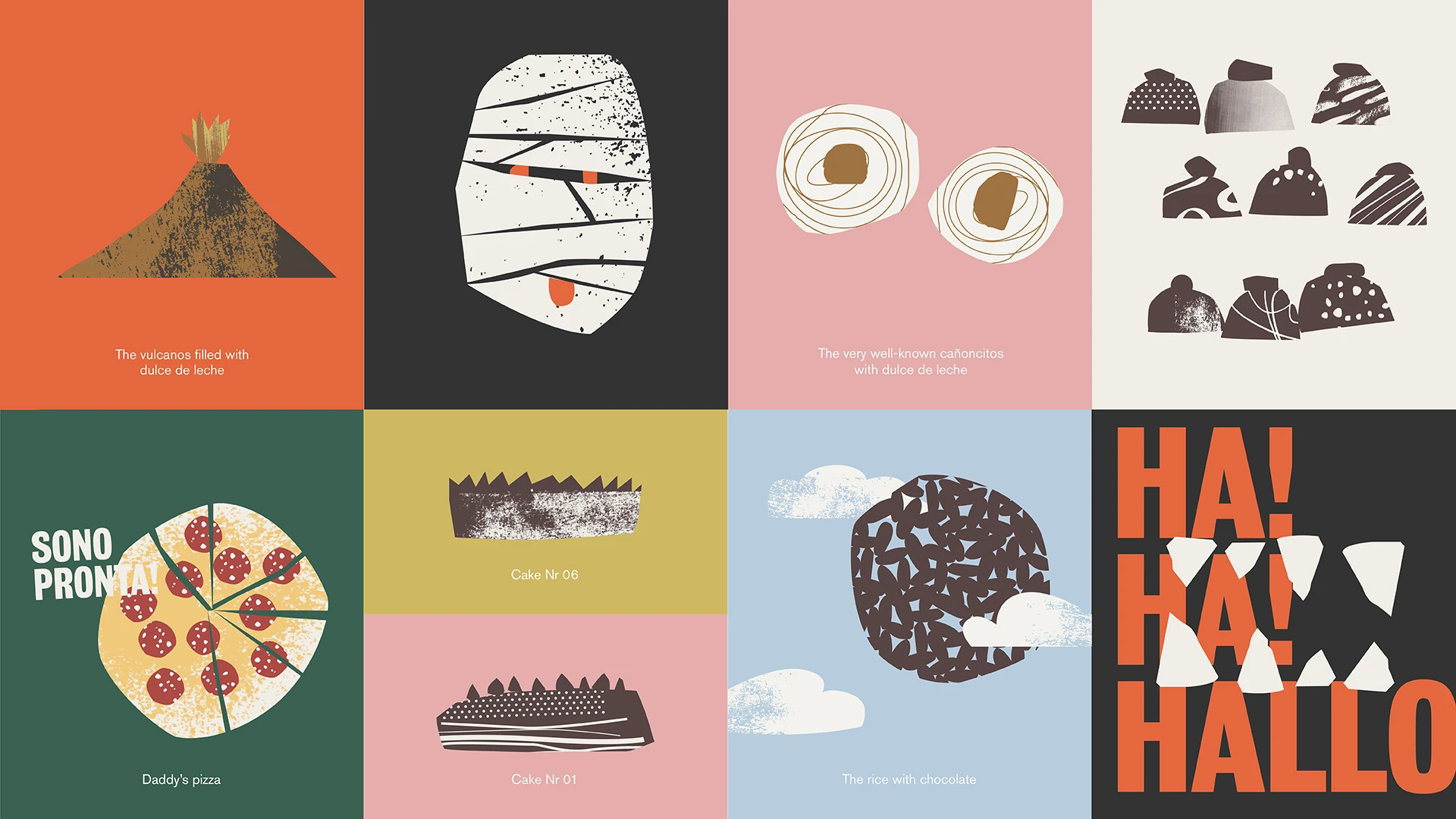
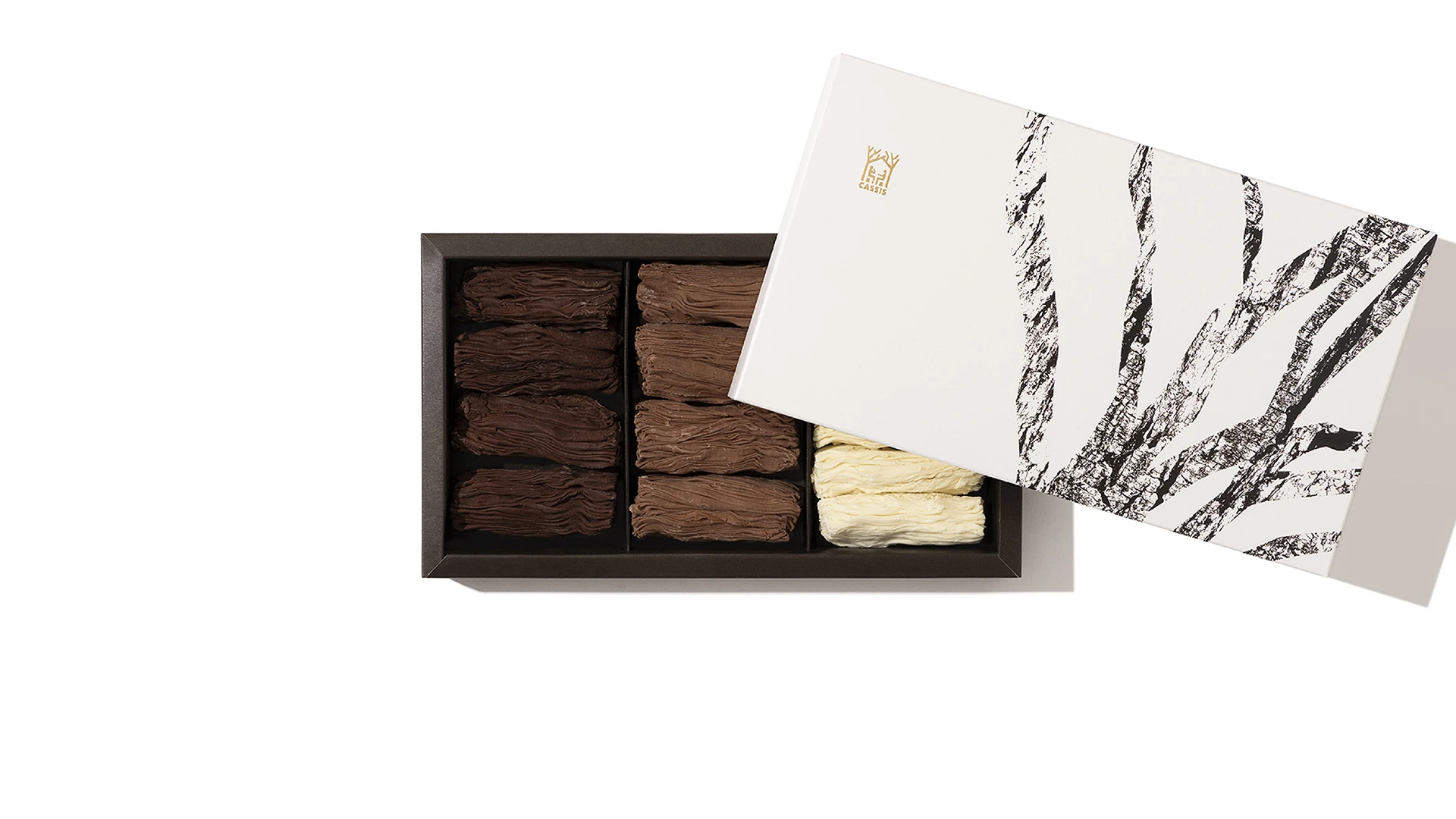
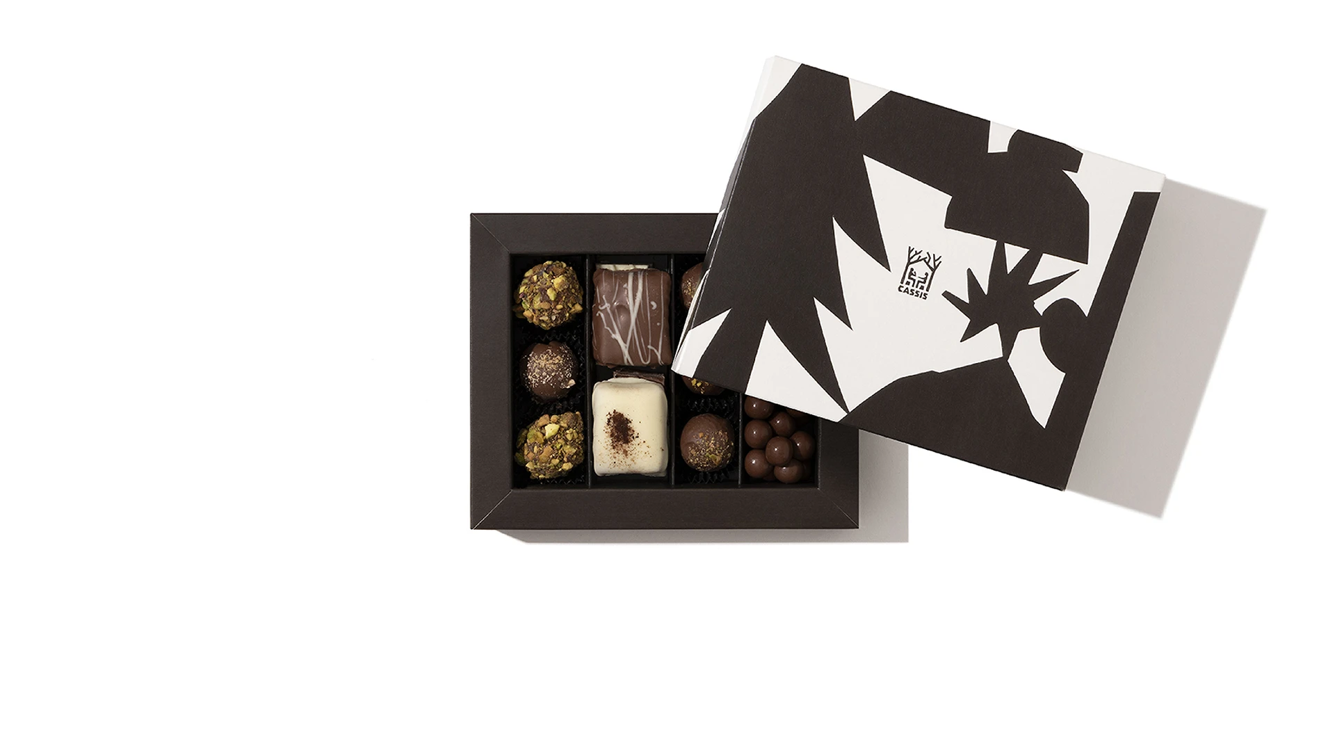
The hand-cut style of the illustrations, much like that of the logo, stems partly from the handcraft of the products and partly from the omnipresence of natural wood in the restaurants. The illustrations convey these characteristics which results in a unique personality.
So much so that they play a central role in both the brand’s communications and its packaging.

The packaging
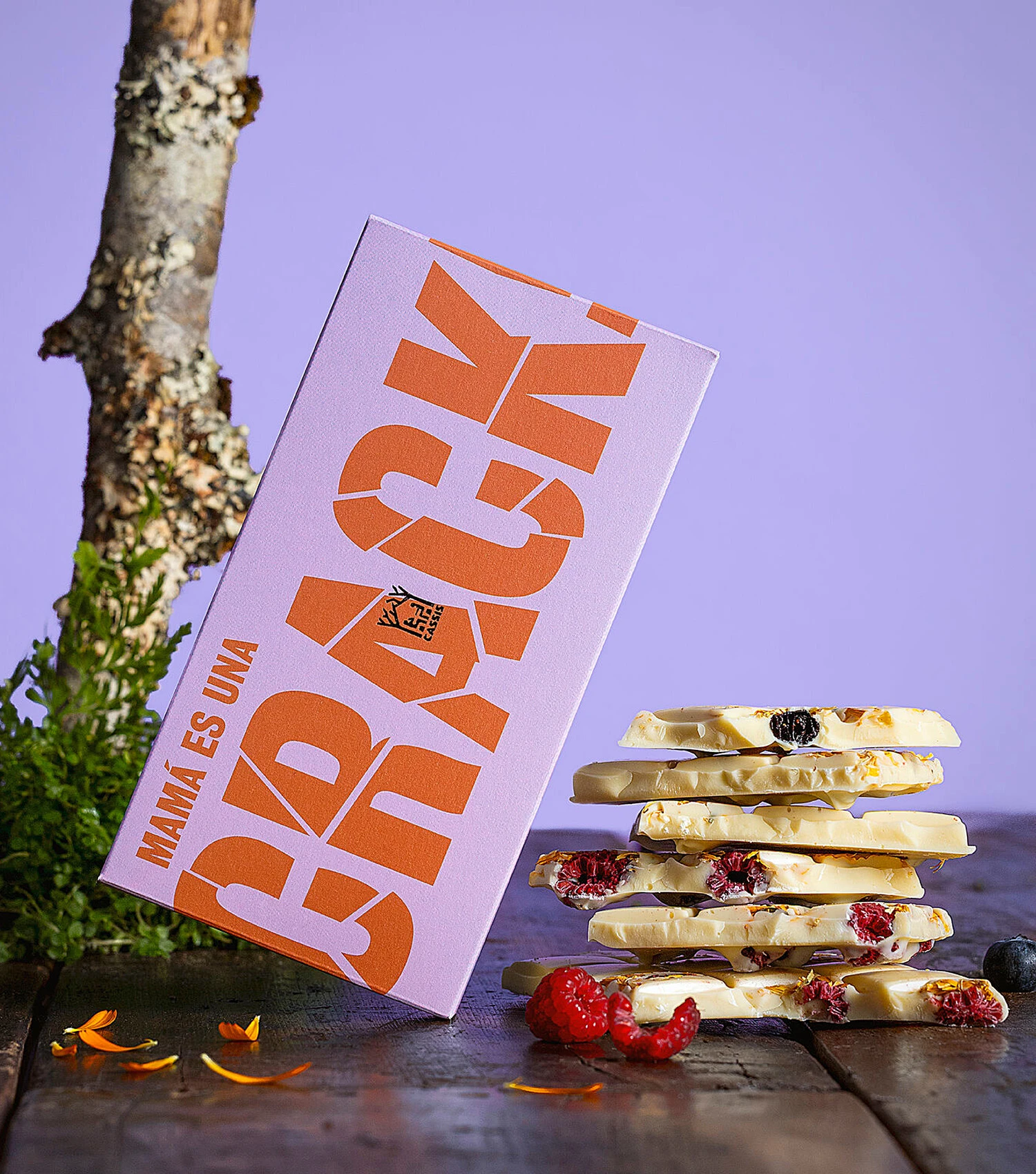
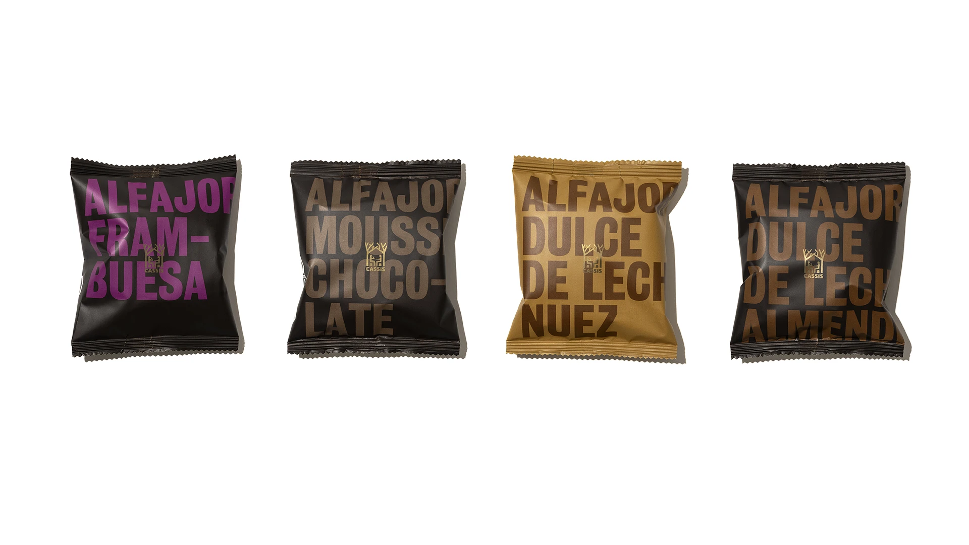
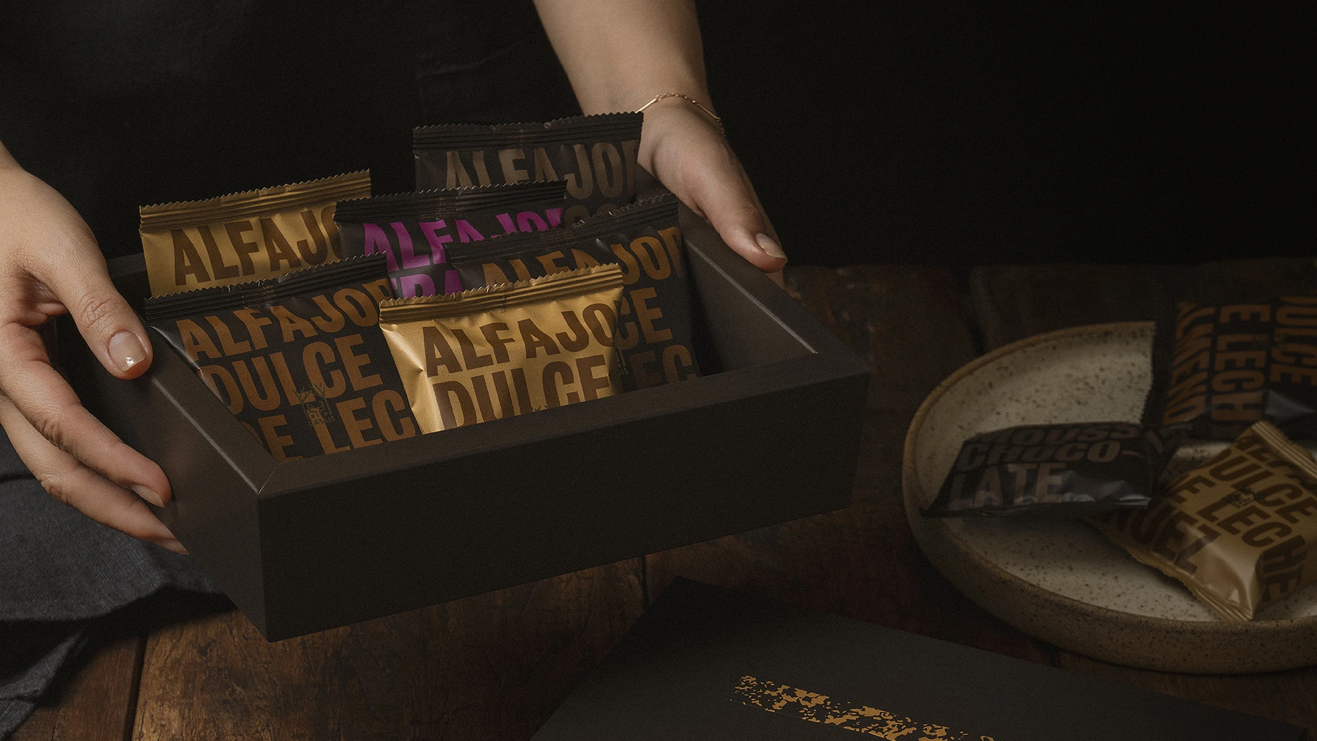
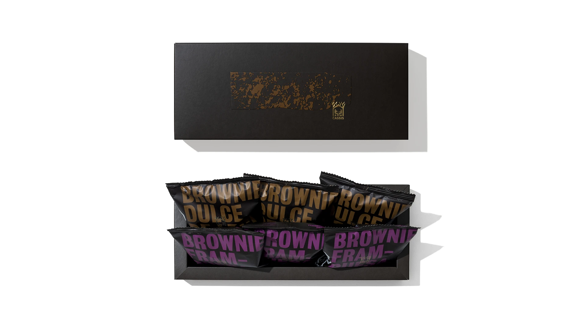
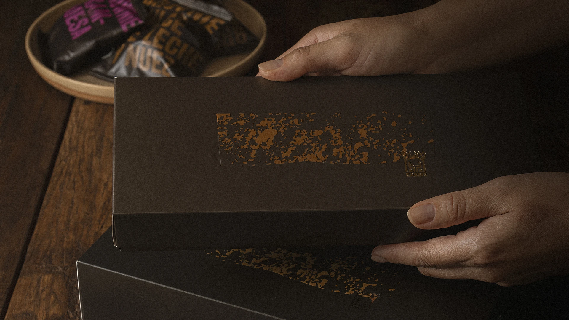
The generic packaging line is delicate, minimalist, and shows special attention to detail. It uses illustrations and typography to create a rich visual rhythm across the entire packaging range. It also features embossing and debossing to enhance the shapes of the illustrations, along with gold foiling for the product names.



The campaigns
Each campaign has its own idea and its way of surprising the audience, but there's coherence in all that diversity of visual and verbal expression forms.
