Sector
Location
Work
- Brand strategy
- Visual Identity
- Verbal identity
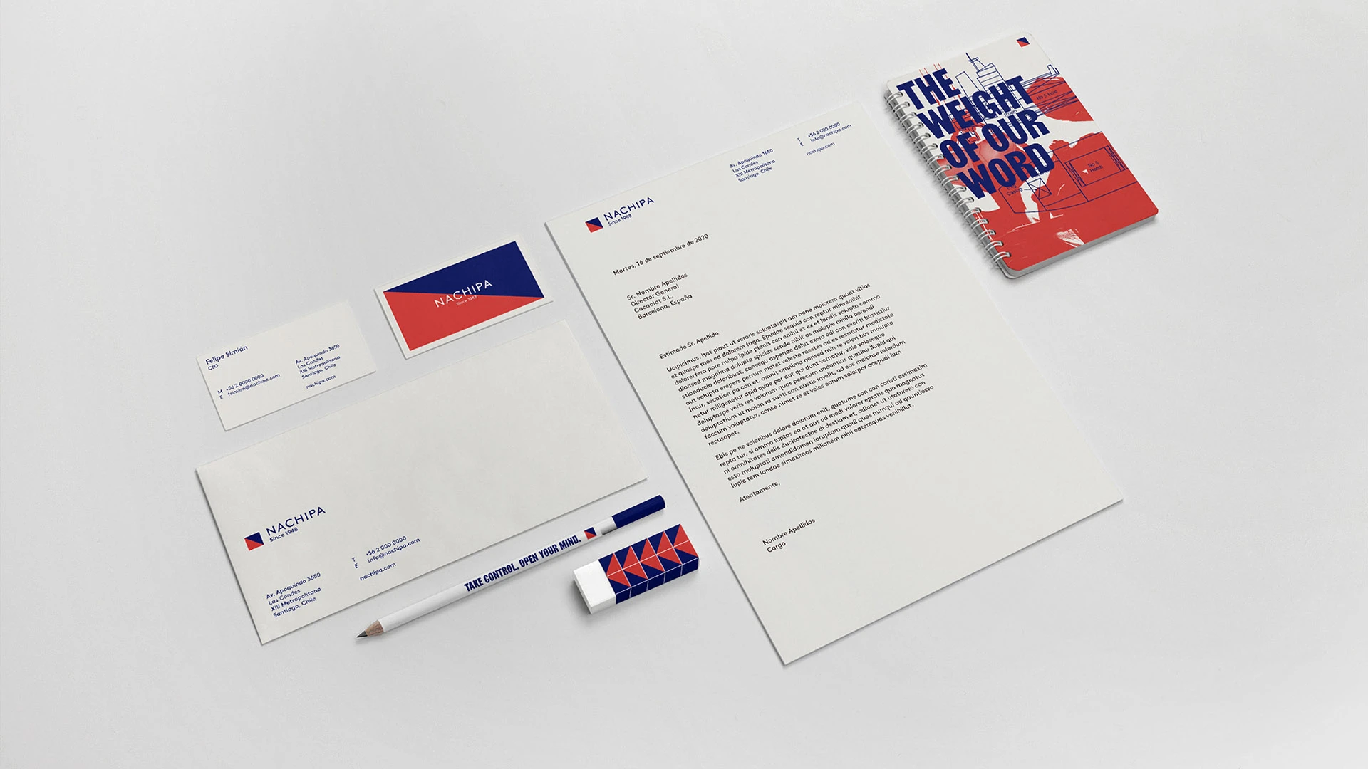
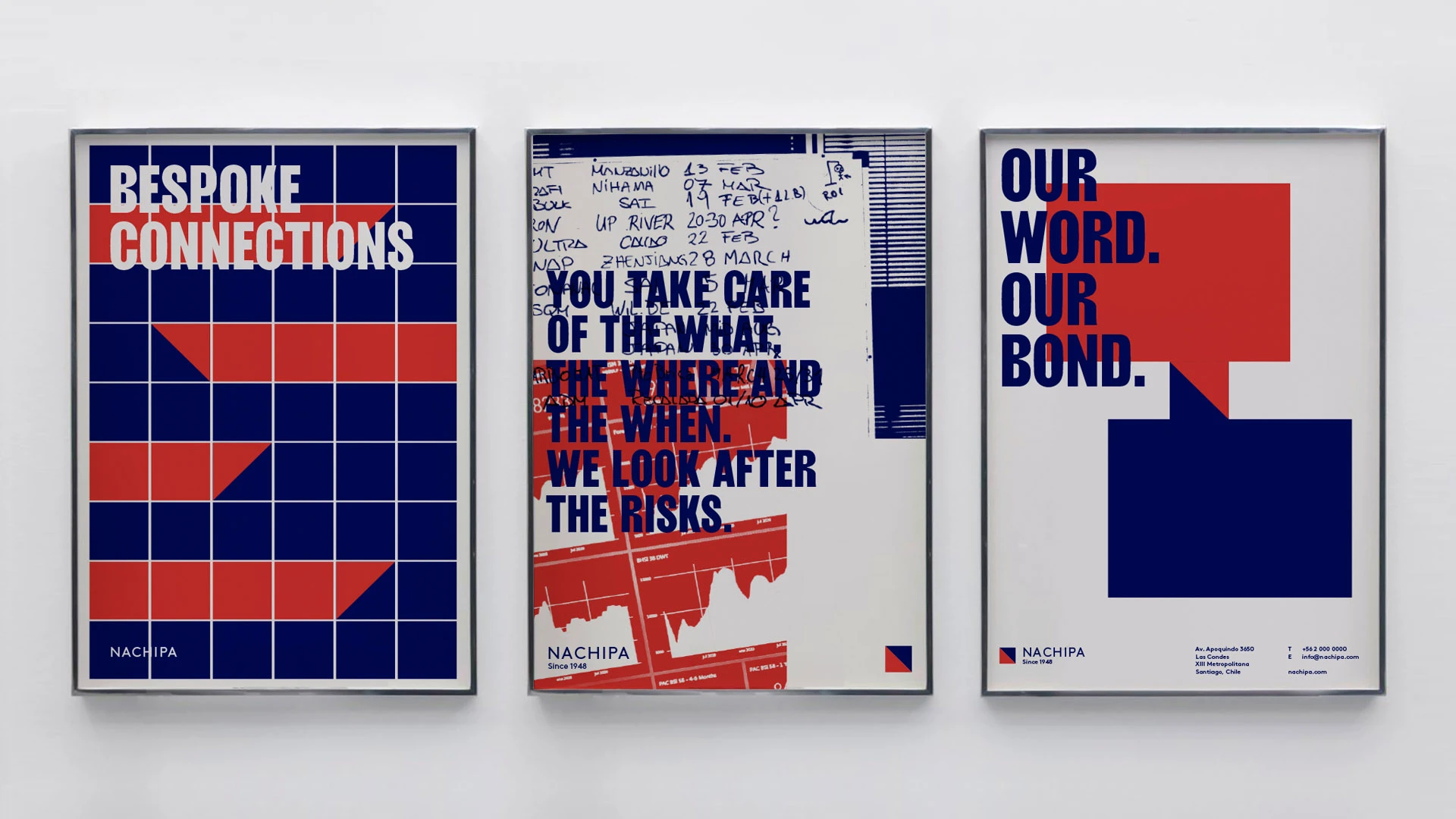
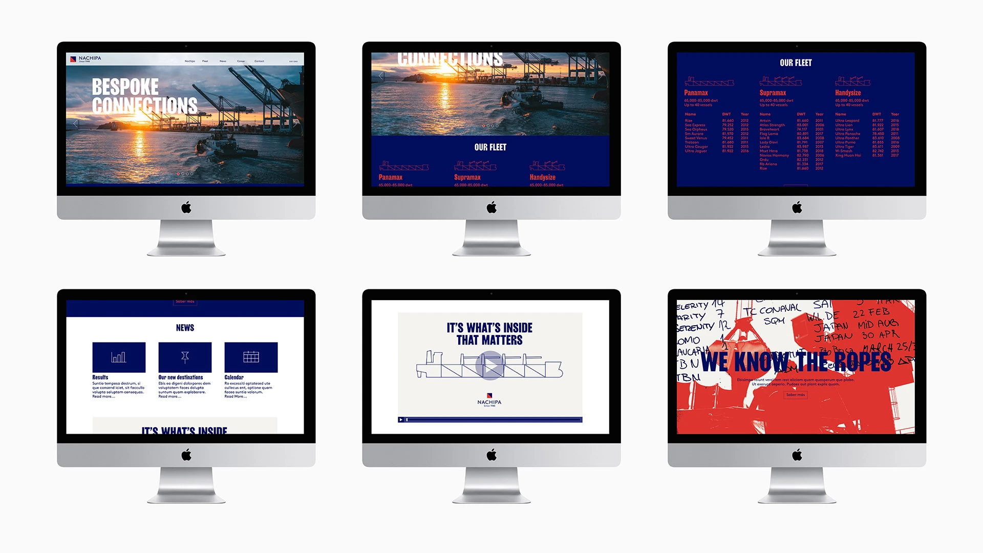
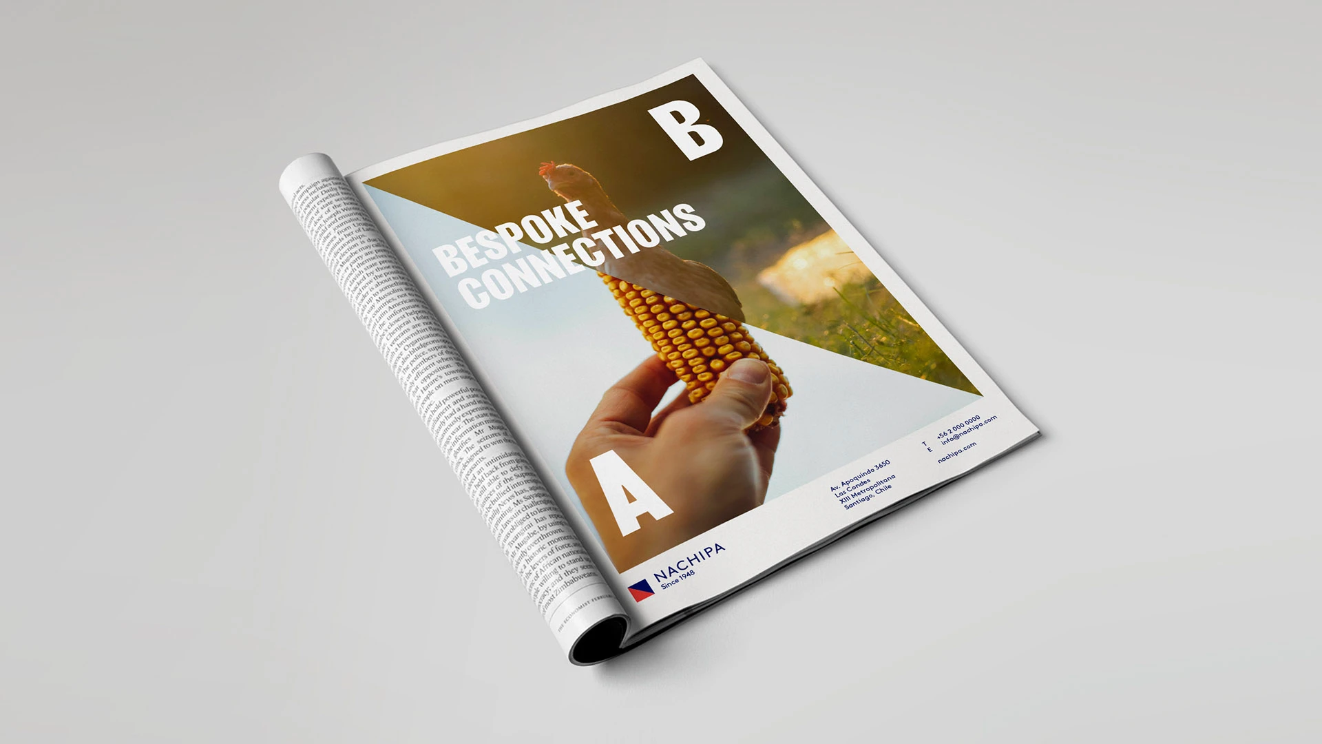
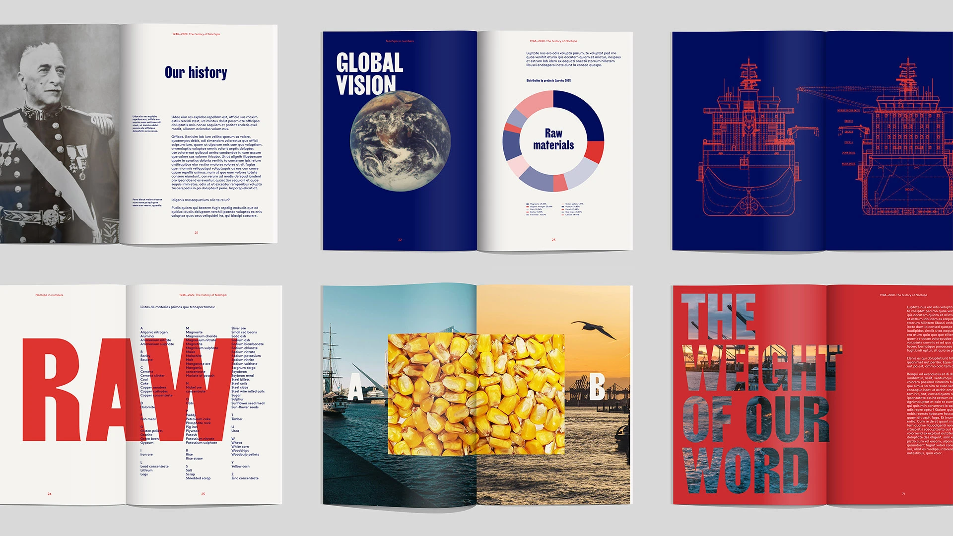
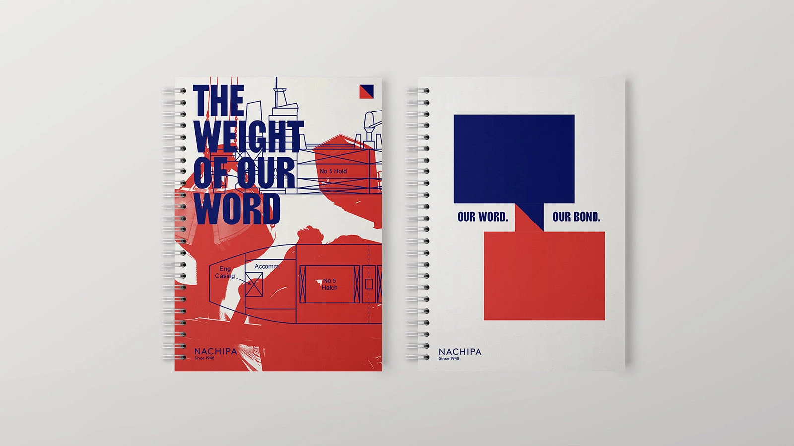
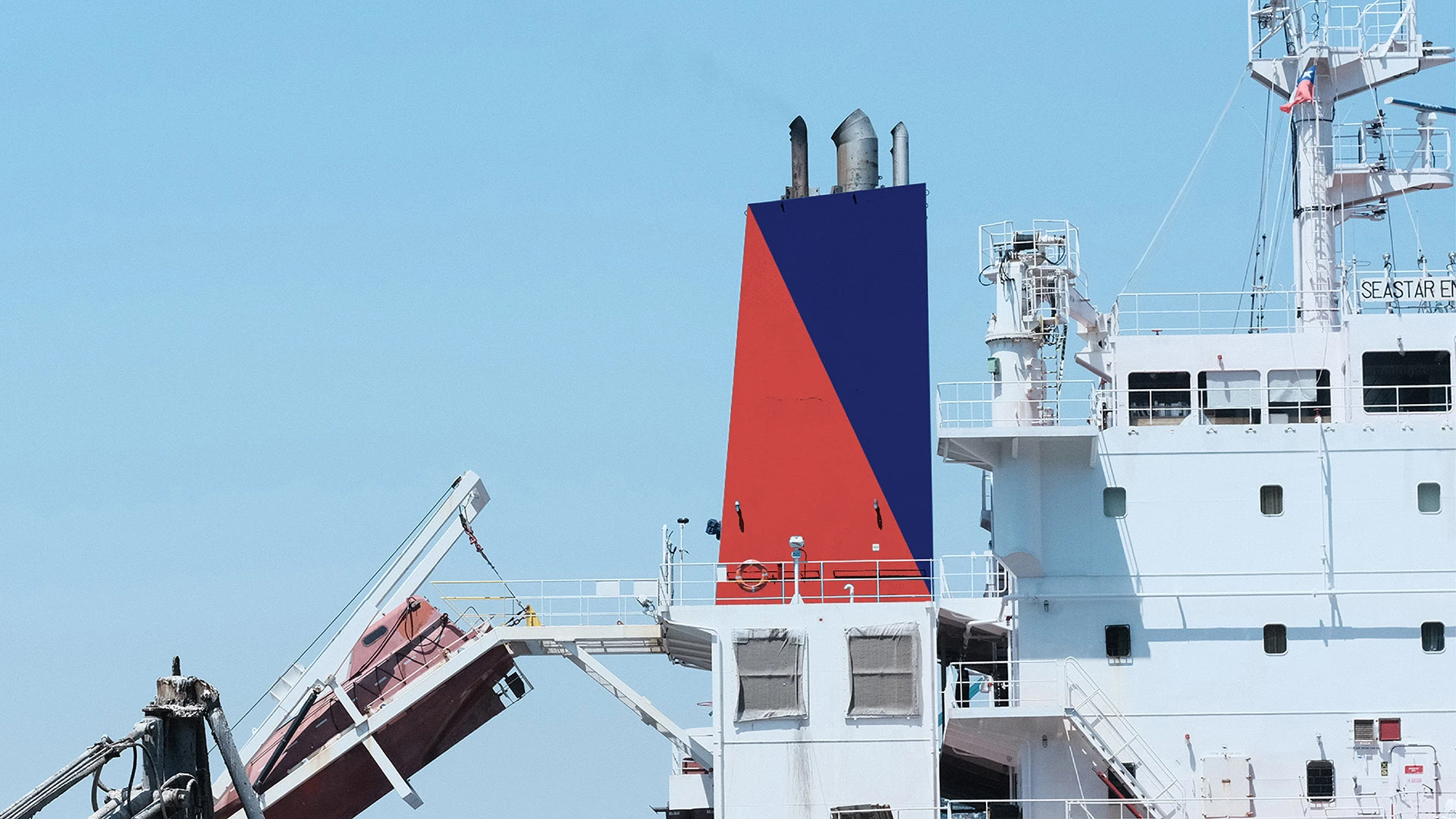
We helped the Chilean-based shipping company Nachipa in its global expansion with a new identity and a profound brand definition, based on the idea of Bespoke Connections. A critical success factor for Nachipa is building unique, lasting relationships. The closer it connects with its clients, the more it will grow and the more cargo connections it will create across the world.
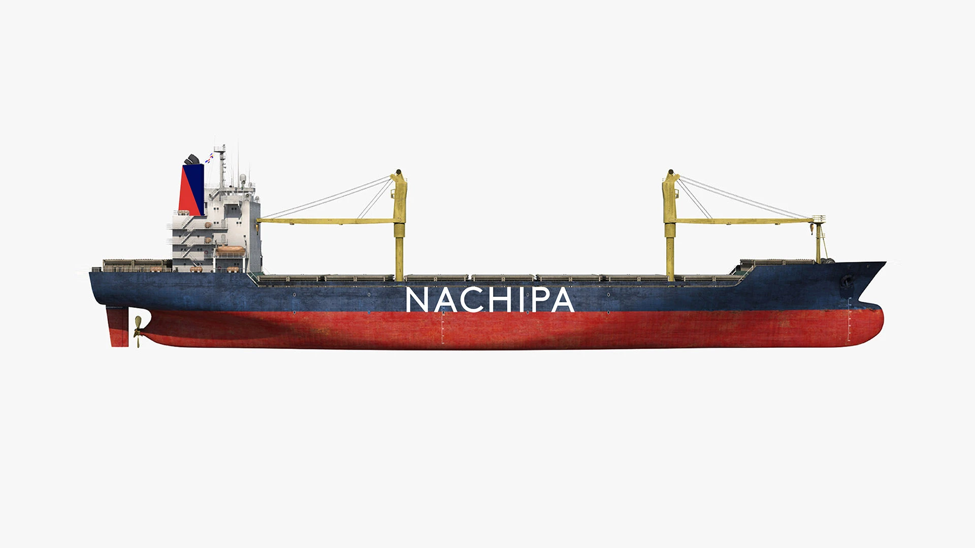
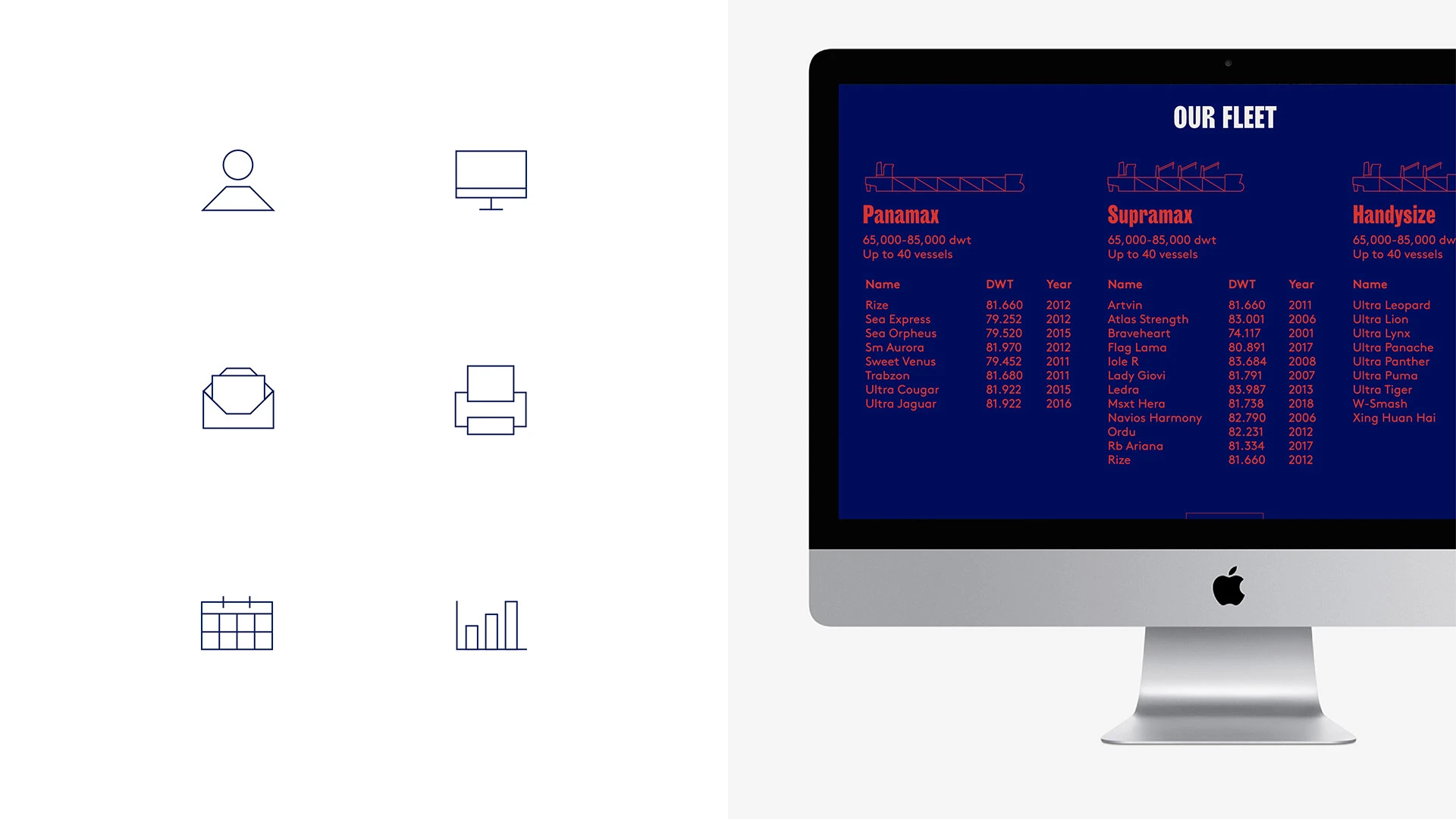
With a natural marine feel, the visual identity conveys strength and solidity. The symbol is inspired by the cargo holds as depicted in the technical drawings of bulk carriers, combining the letter 'N' with a flag. Founded in 1948, Nachipa is the last of its kind in the South, which makes us very proud to have worked on its identity.
