Sector
Location
Work
- Strategic reflection
- Visual Identity
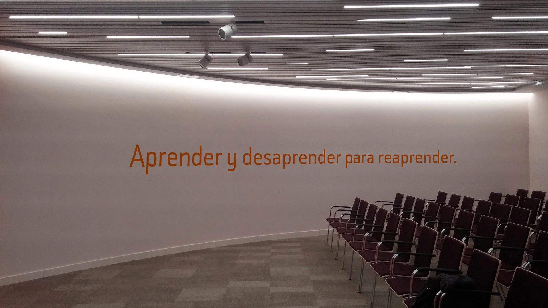
- Tone of voice
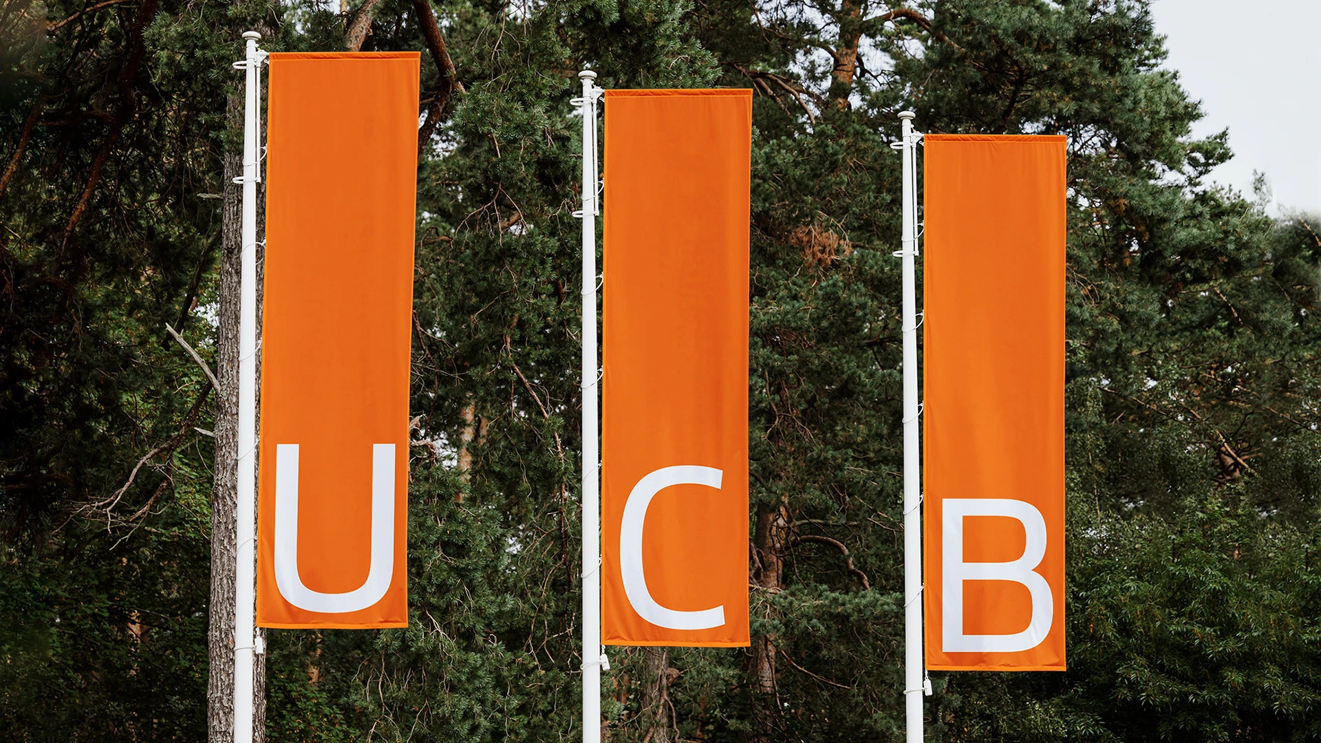
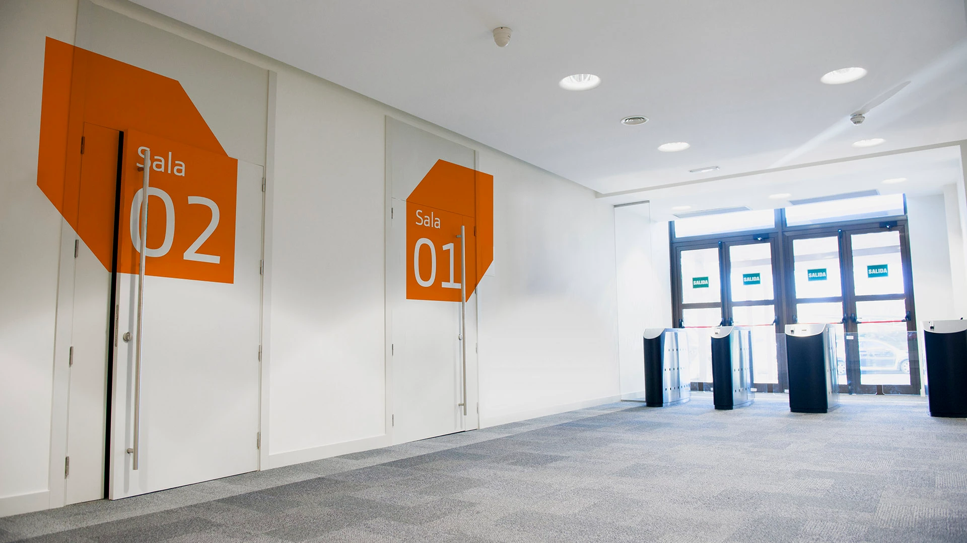
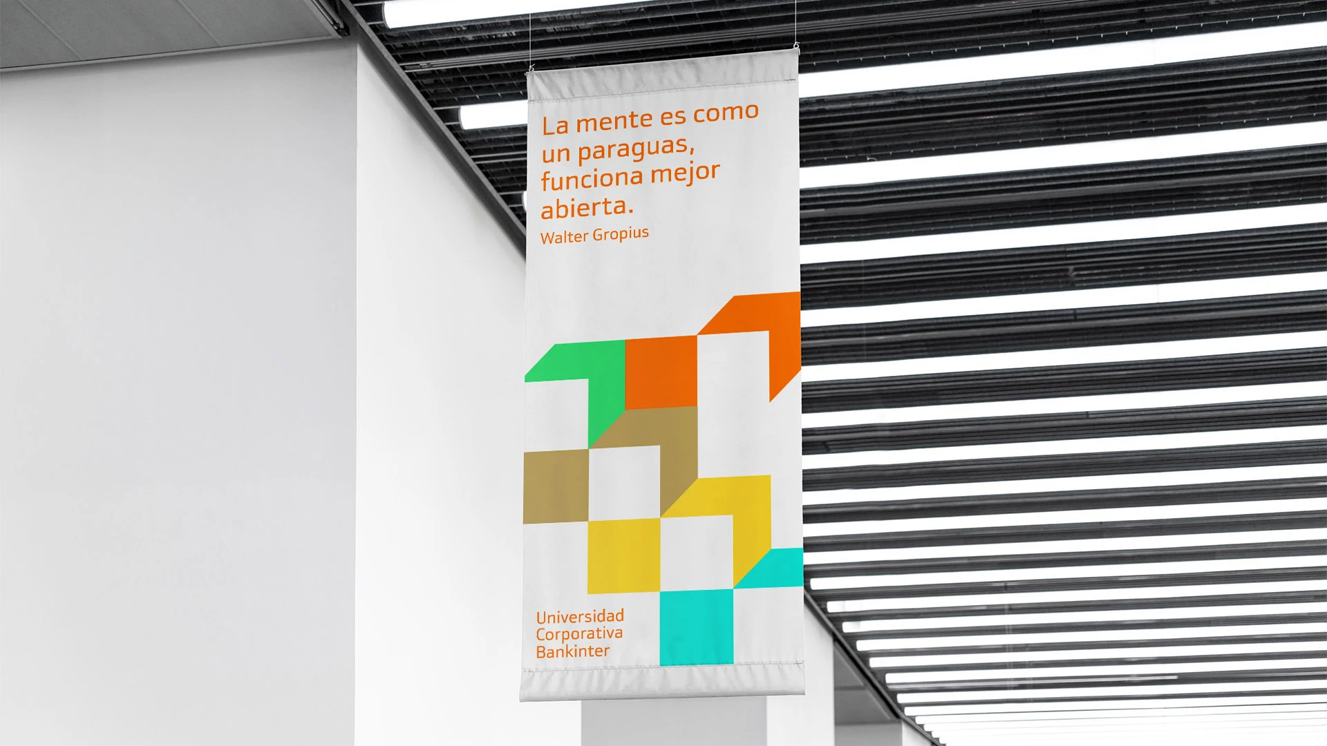
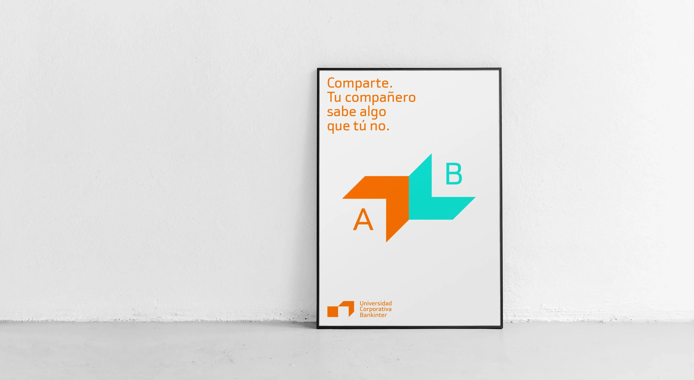
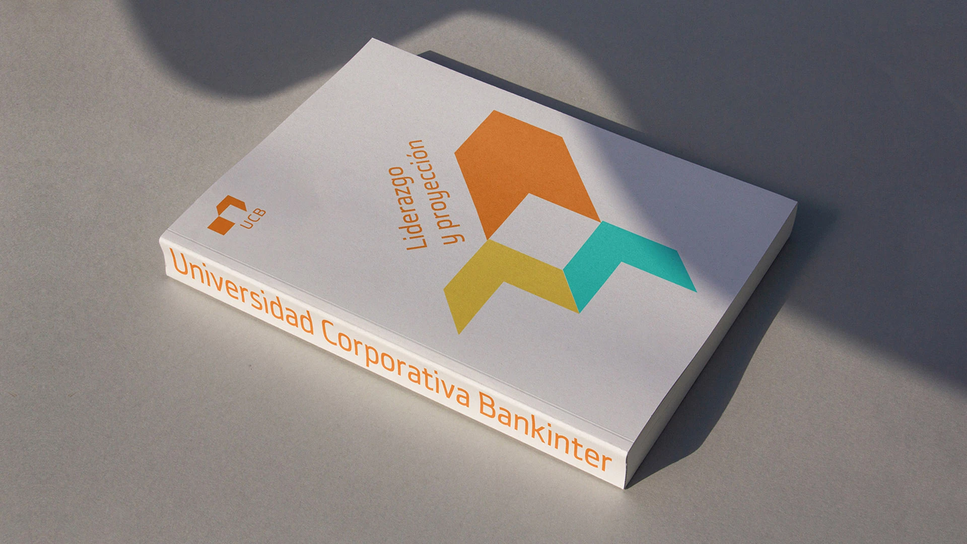
We were in charge of the new visual identity for the Bankinter Corporate University, dedicated to the training of the bank's employees. The logo has a very simple shape and it represents an open space. Starting from this new symbol and the colour palette, we designed a visual language based on the arrow pointing upwards, diagonals and straight angles, solid shapes.
The meaning of the logo is strongly connected with the positioning of the University: an open door for learning, an open mind for knowledge, being open to new ways of learning, being open to learning from your colleagues, an open future for personal development.
