

it's pure logic
Sector
Location
Work
- Brand review
- Brand strategy
- Verbal identity
- Visual Identity
- Implementation
- Brand engagement
To be David in the land of Goliath. To be irreverent in a traditional world. To be the low-cost airline in a market of legacy prices. To be the first to dare. To be simple in a complex industry. To be useful instead of pretending. To move forward instead of backward. To recognize your identity instead of inventing it.
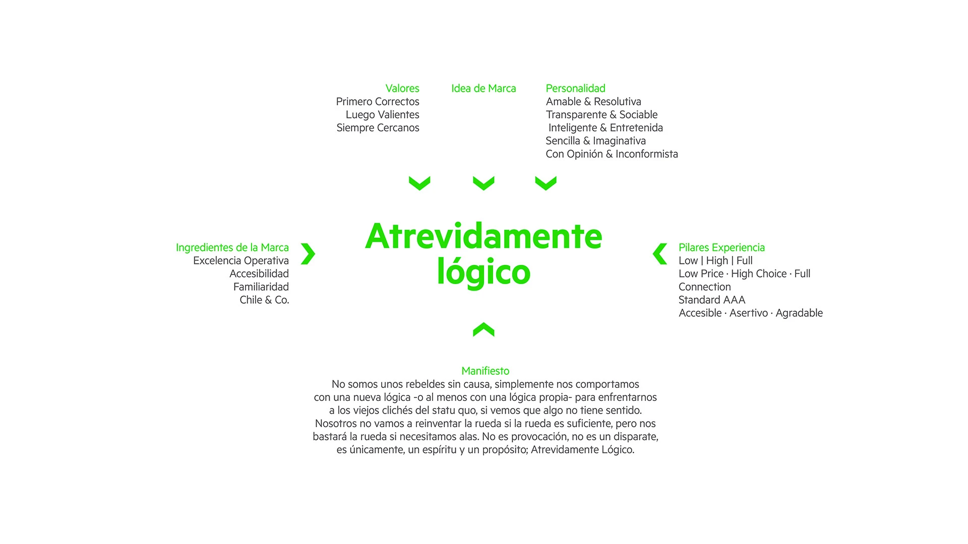
SKY, daringly logical. Yes, a modern and attractive identity, but above all simple, ingenious, brave and authentic. That was the challenge and that is what we tried to achieve. It was about looking at reality from a different perspective; so easy, yet so unexpected.
The plane
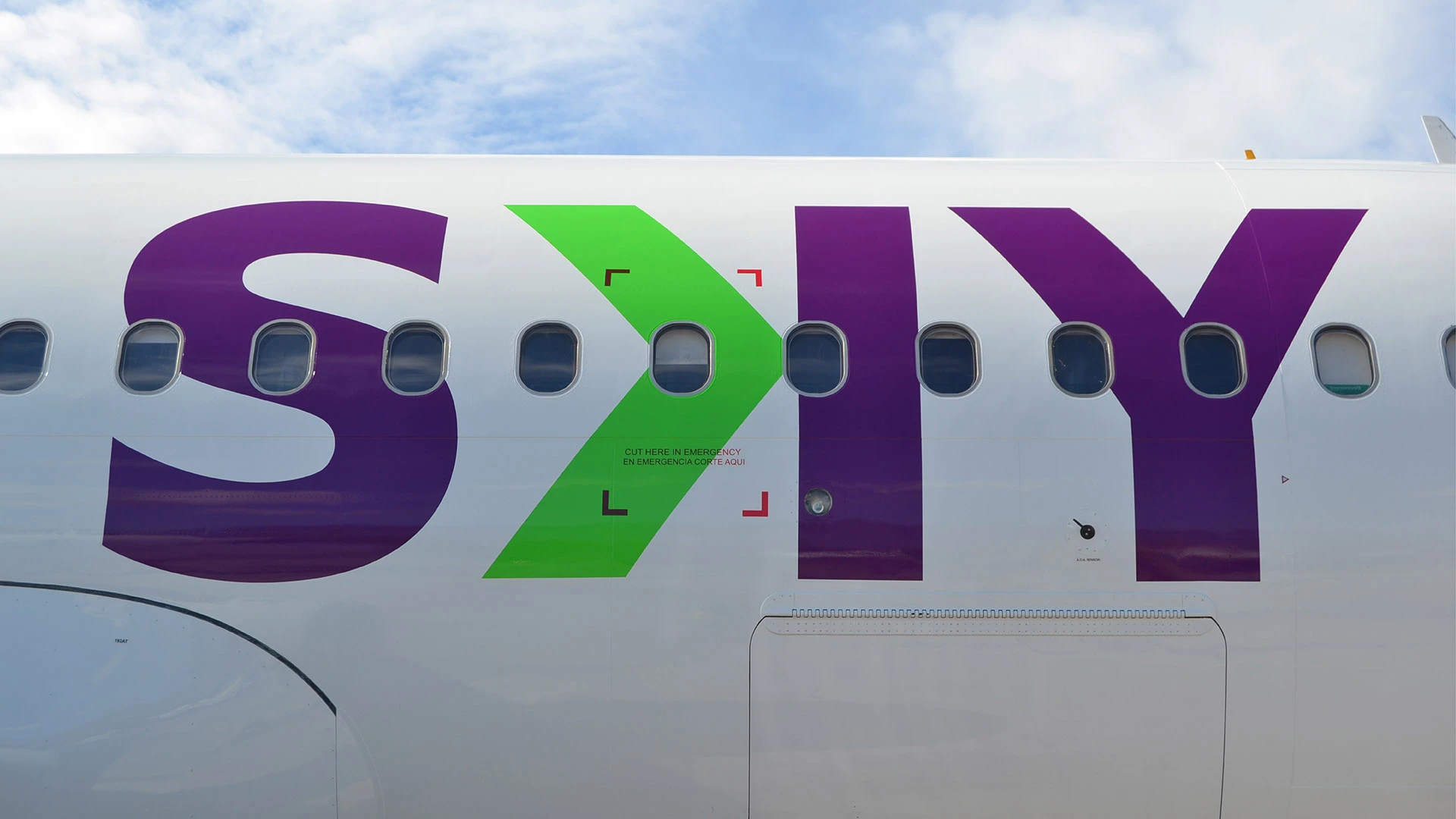
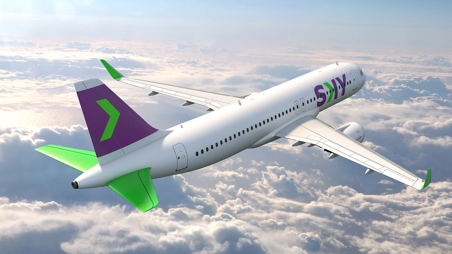
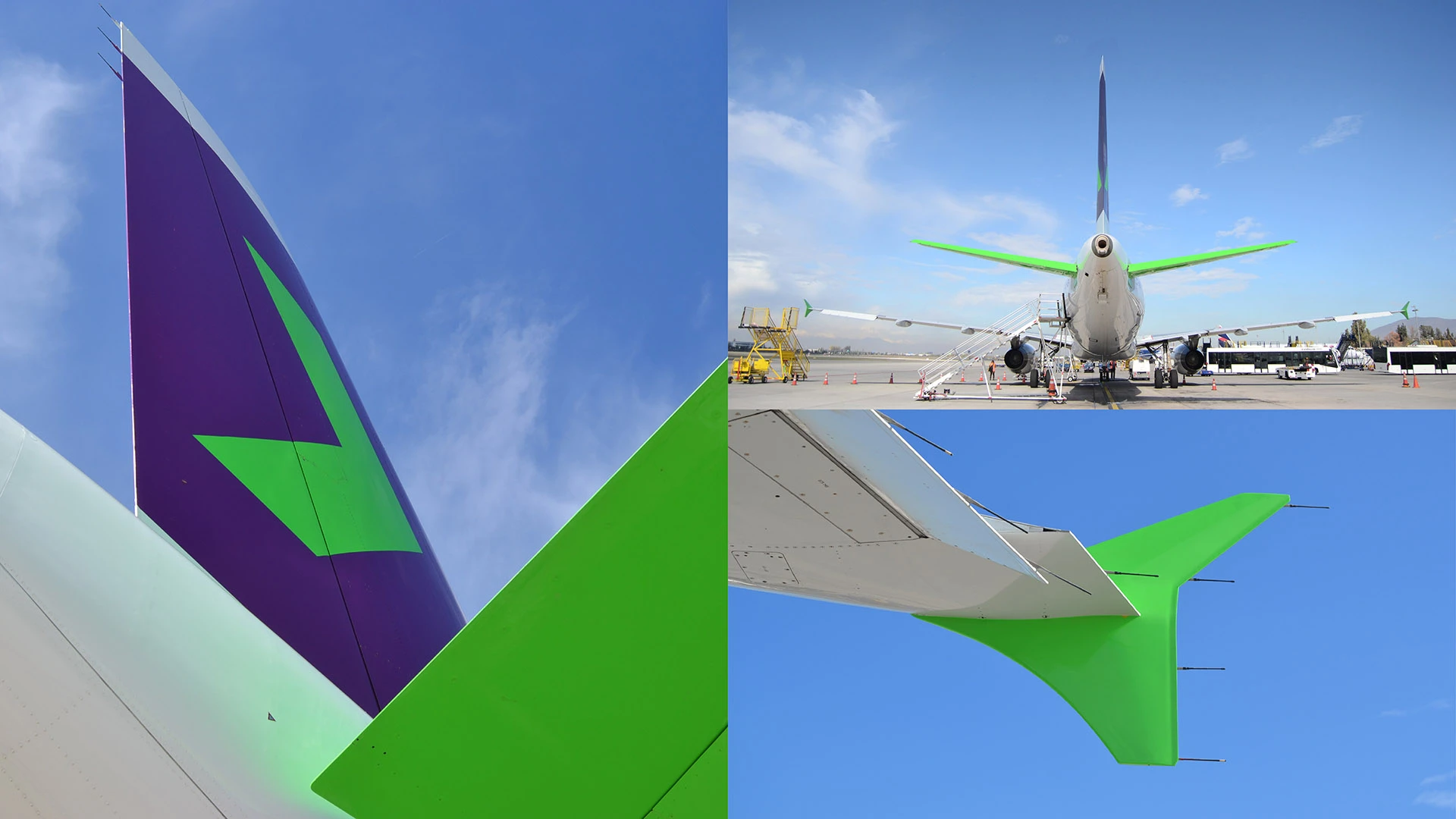
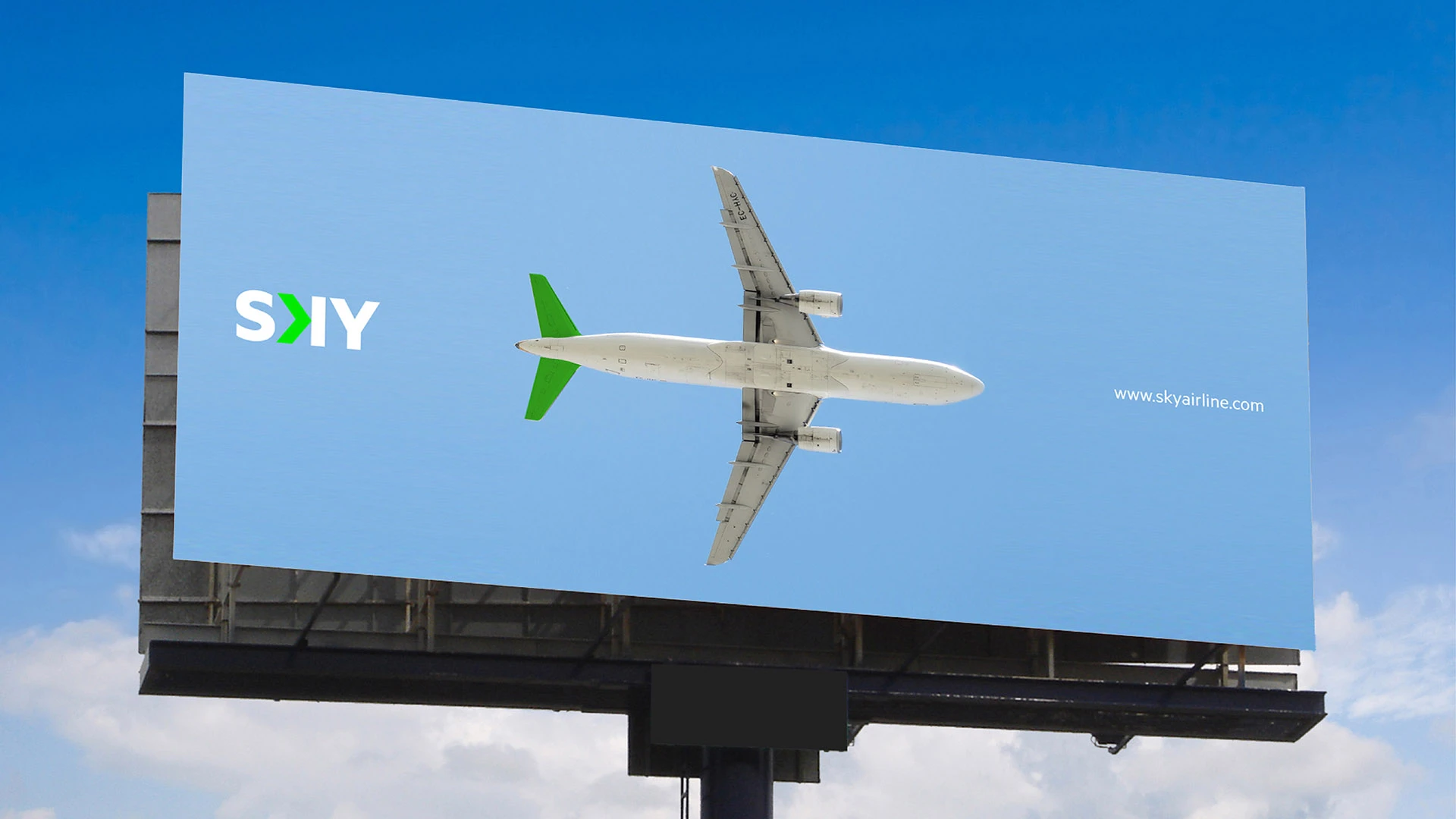
As with any airline, the aircraft was the primary expression of the brand. In this case, there was an added challenge: achieving a modern and distinctive design while retaining a white paint base. SKY receives its aircraft on lease in white and must return them in the same condition. As the company shifted to a low-cost business model, any investment that would align with this new reality was welcome.
The idea, then, was to intervene as intelligently as possible—preserving the white base and opting for minimalist yet striking solutions. Keeping this in mind, the logo changes its layout depending on which side of the aircraft it appears, ensuring that the arrow always points forward.

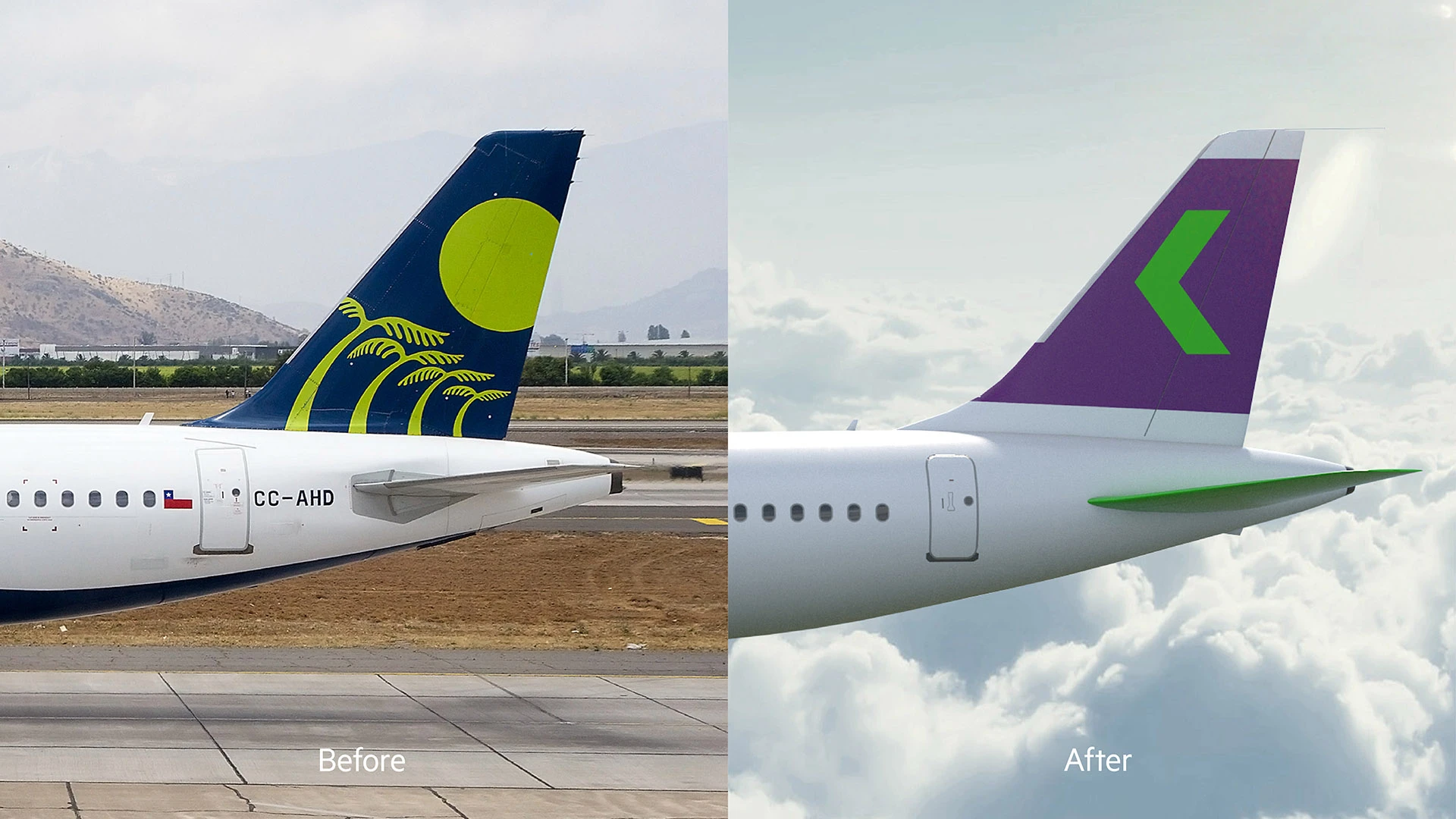

Communication
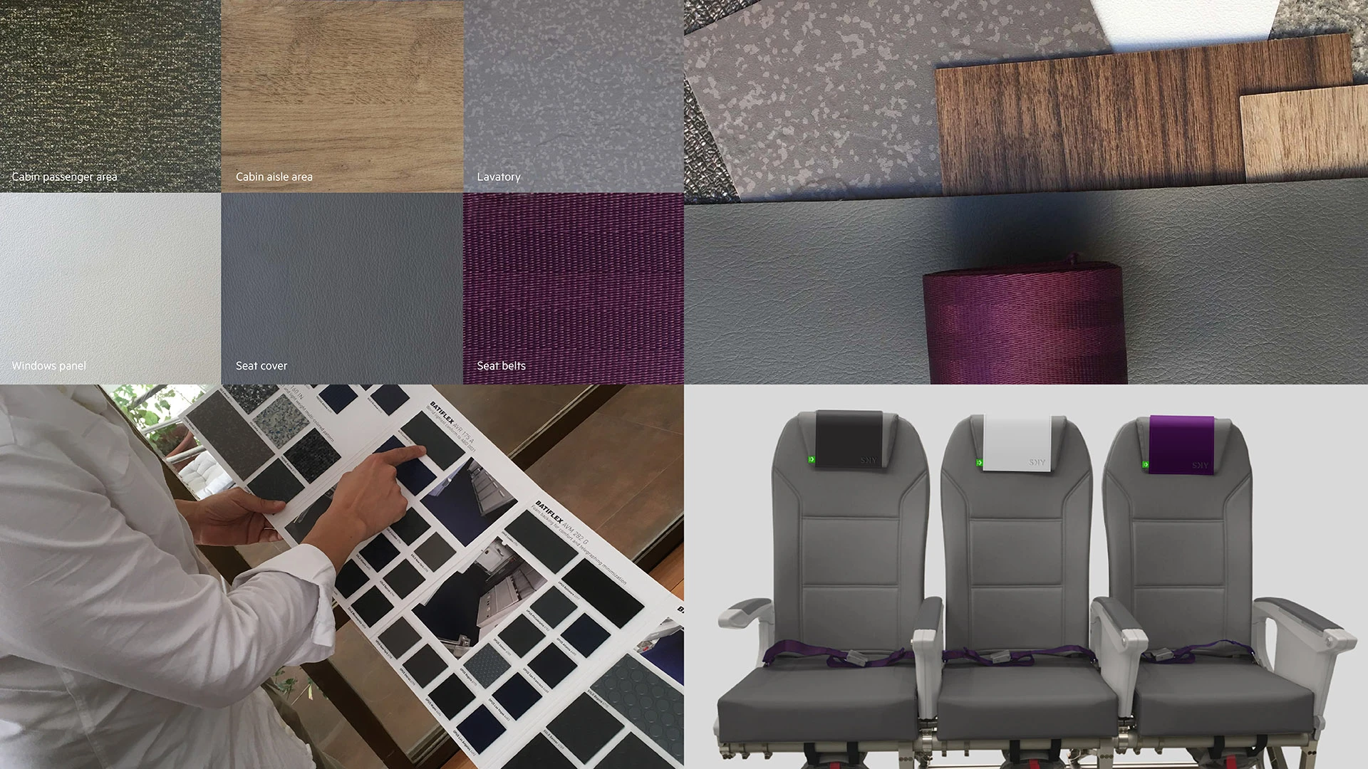
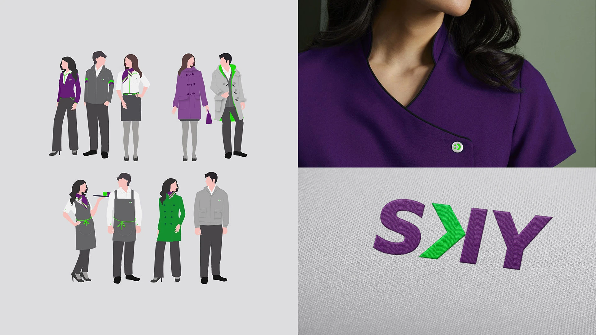
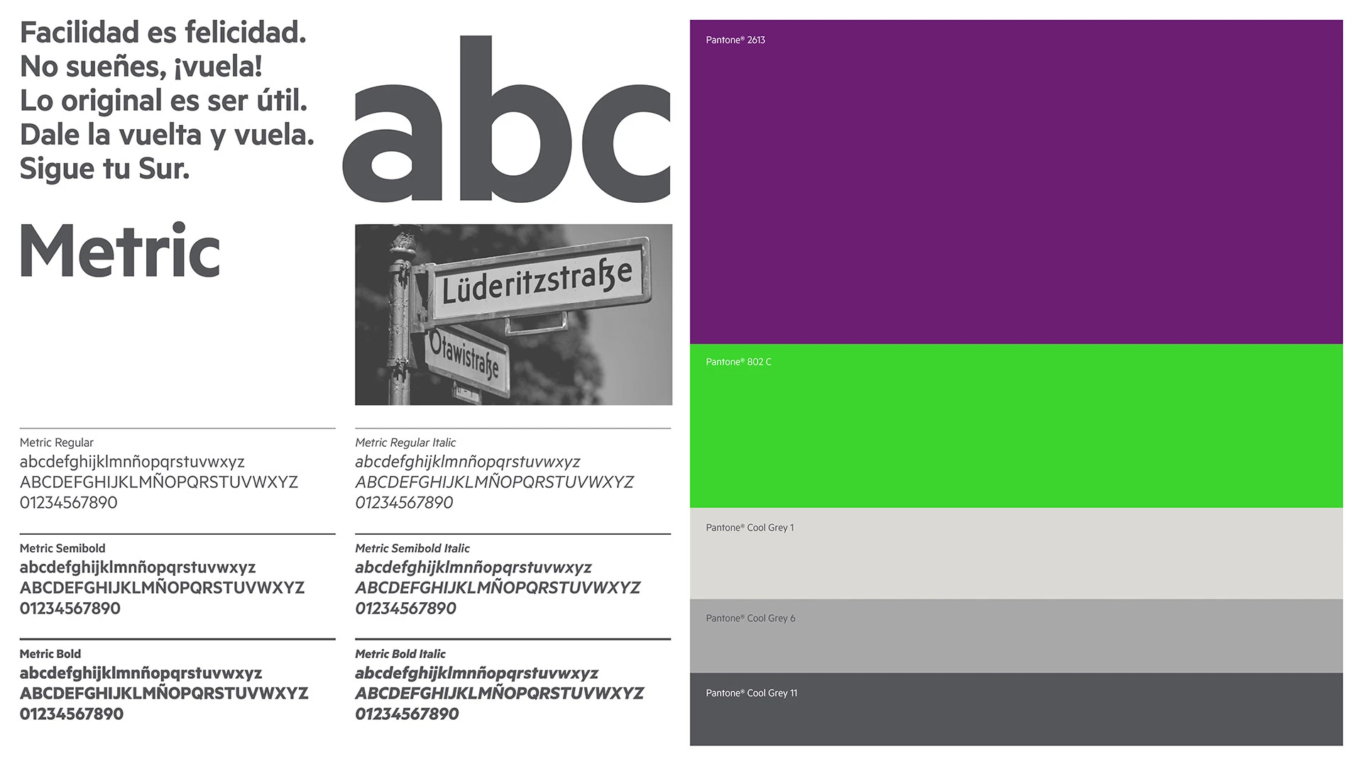
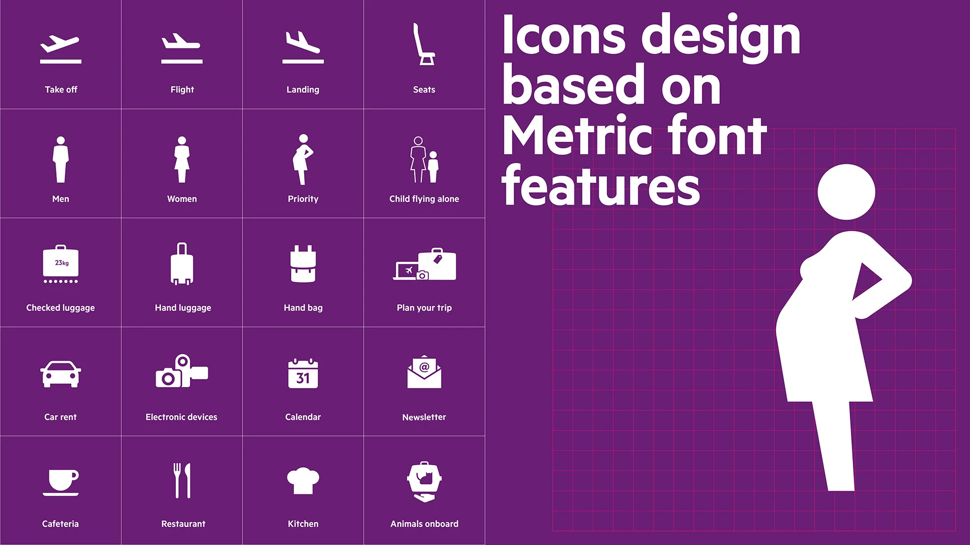
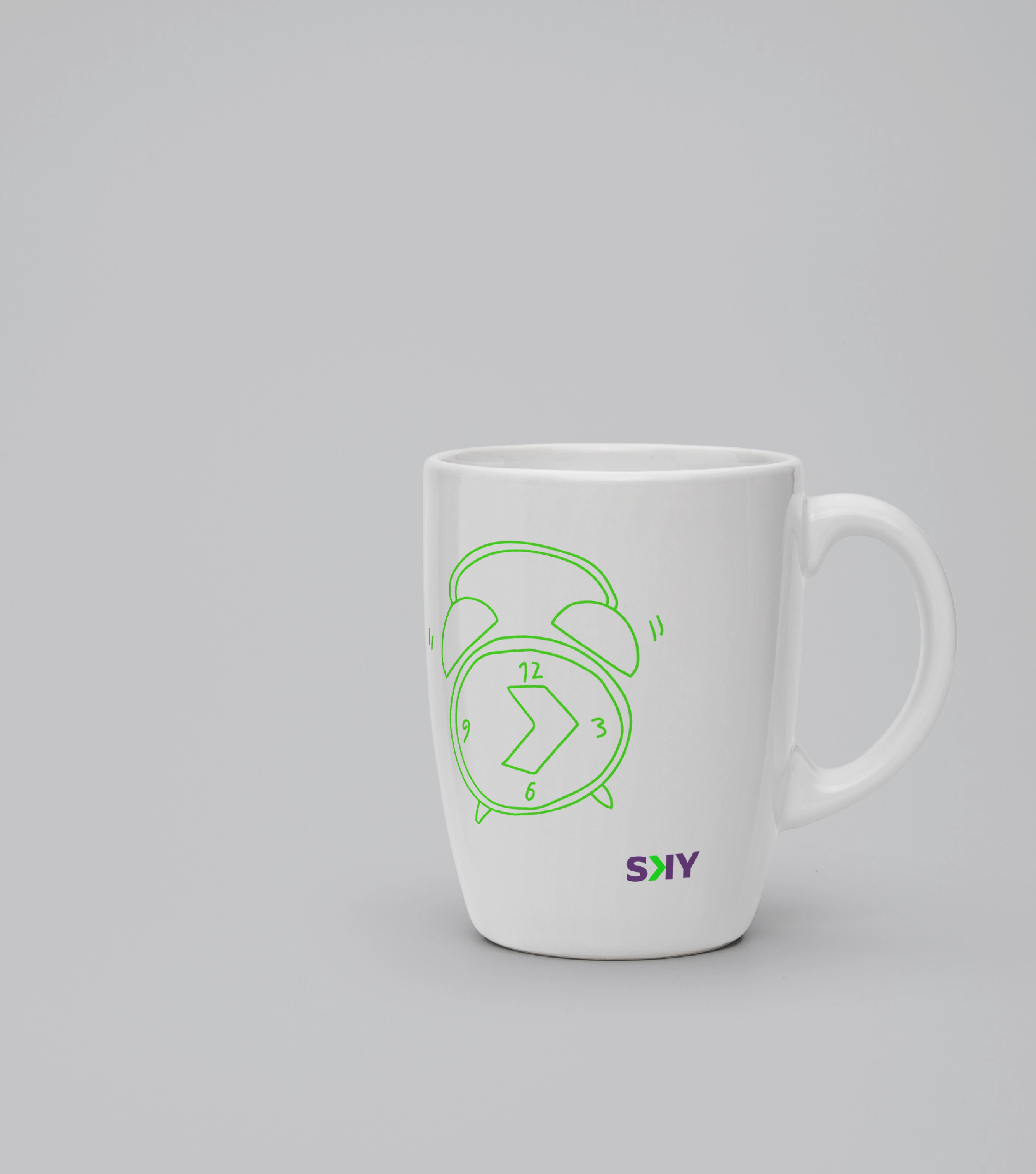
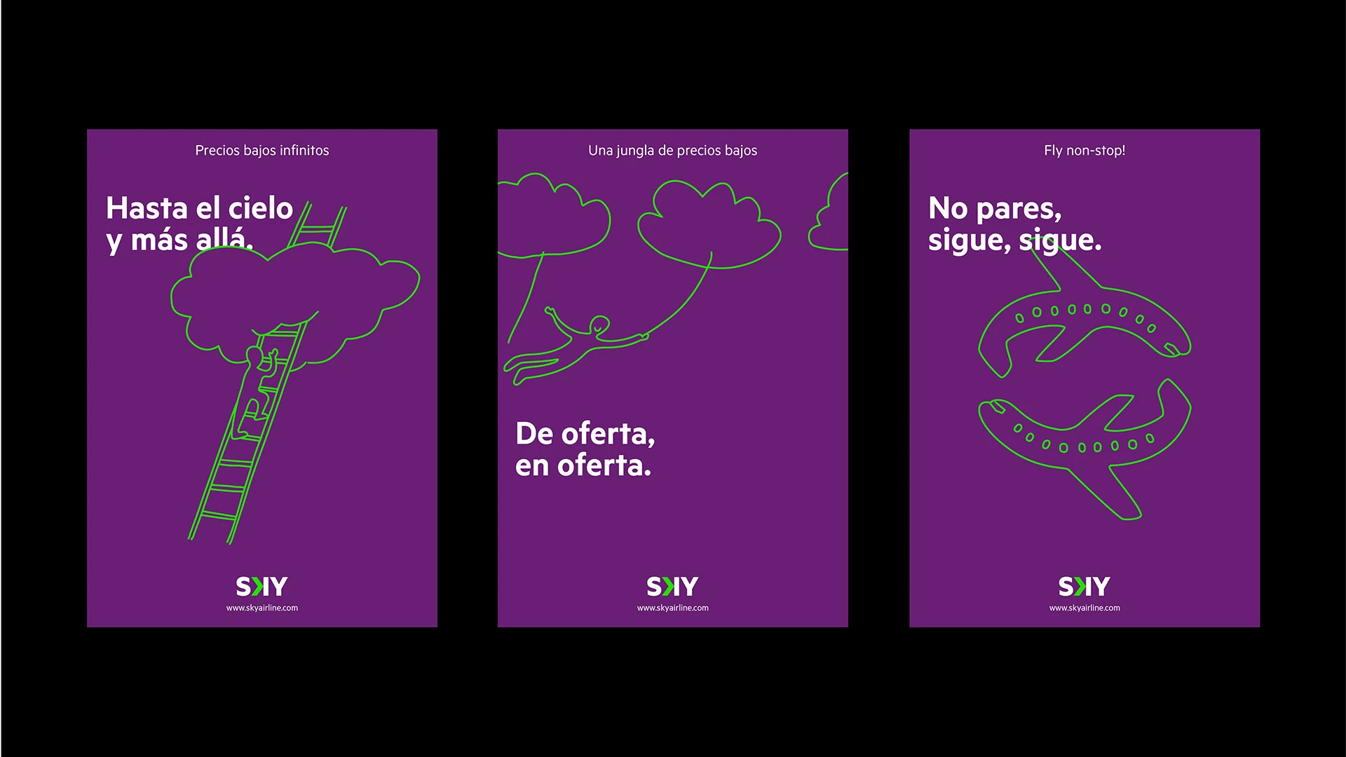
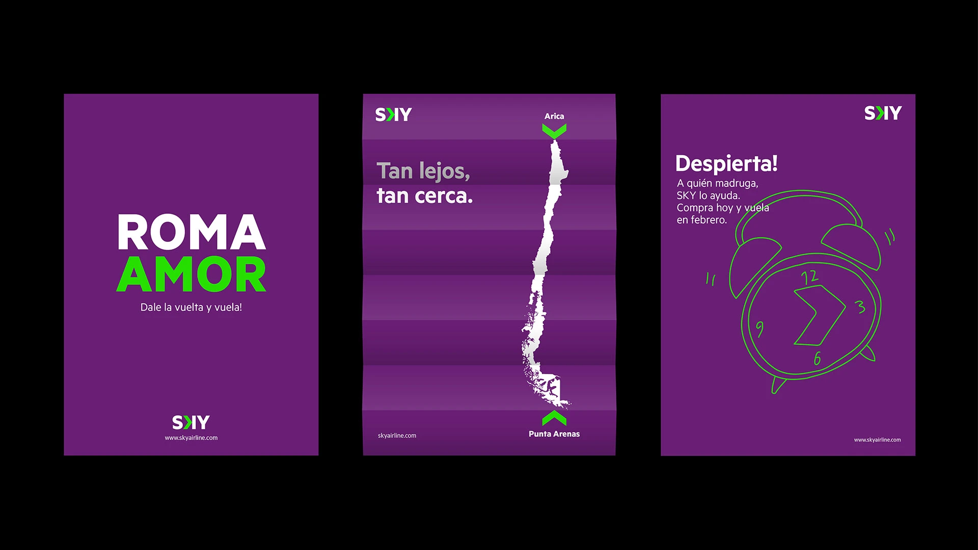
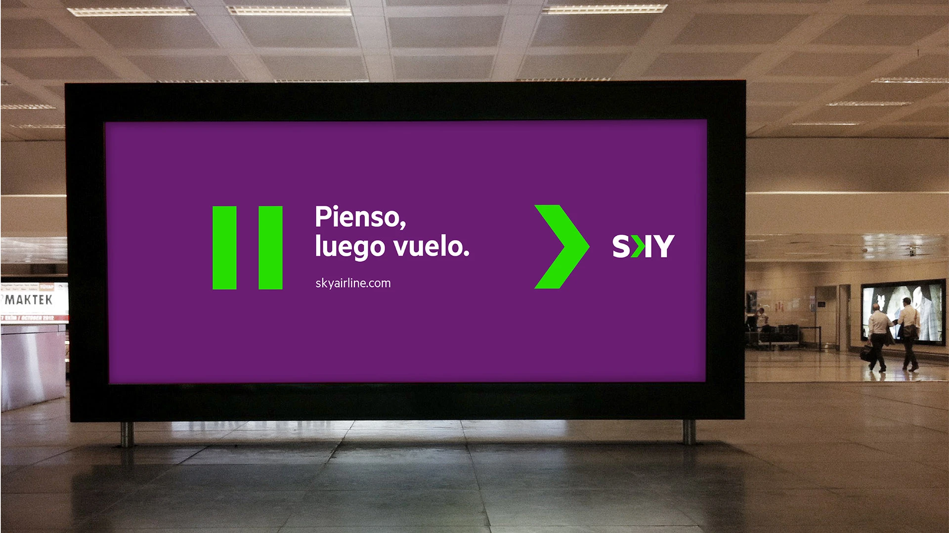
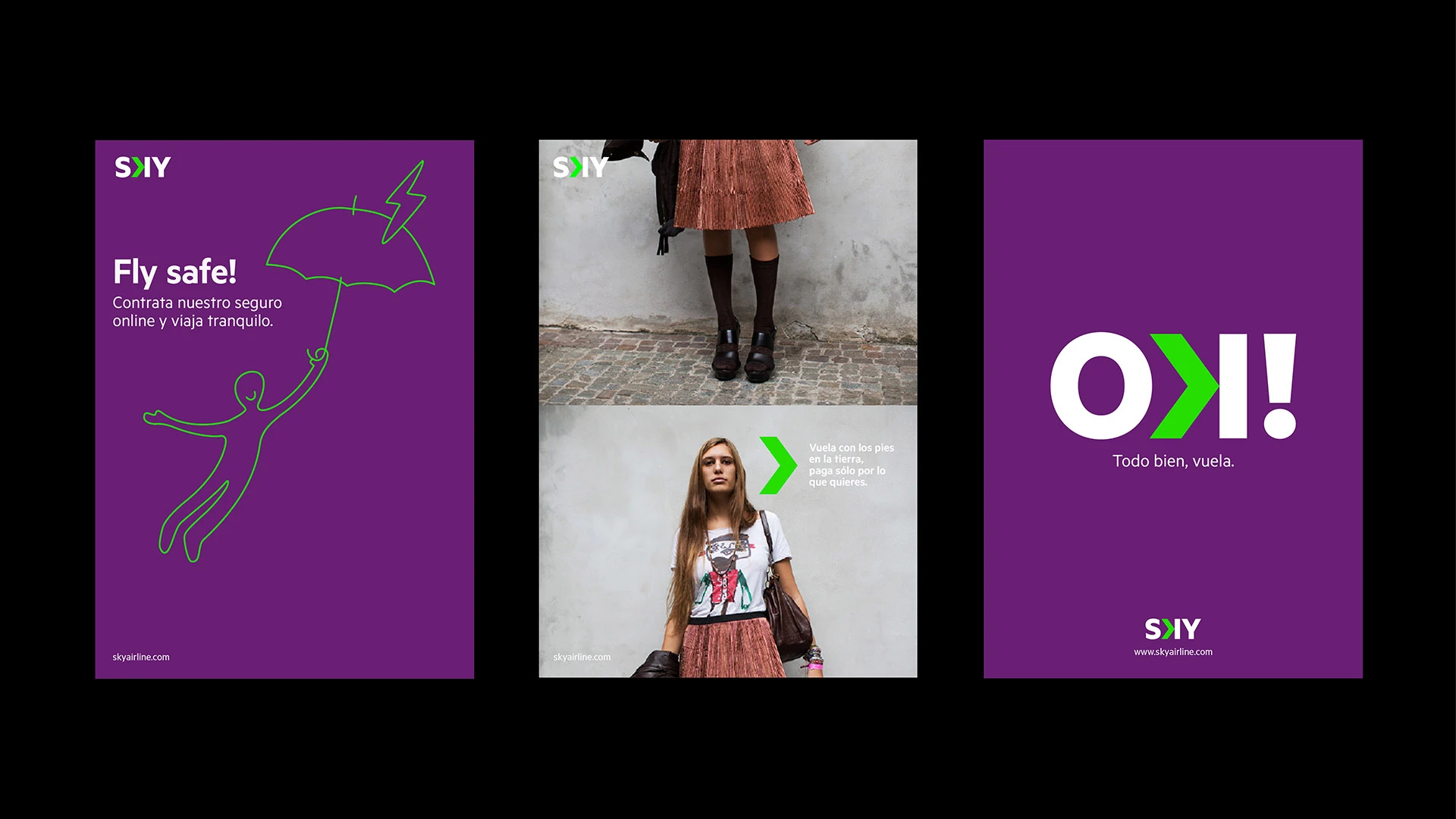
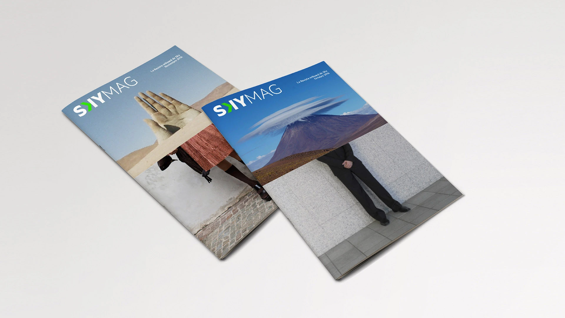
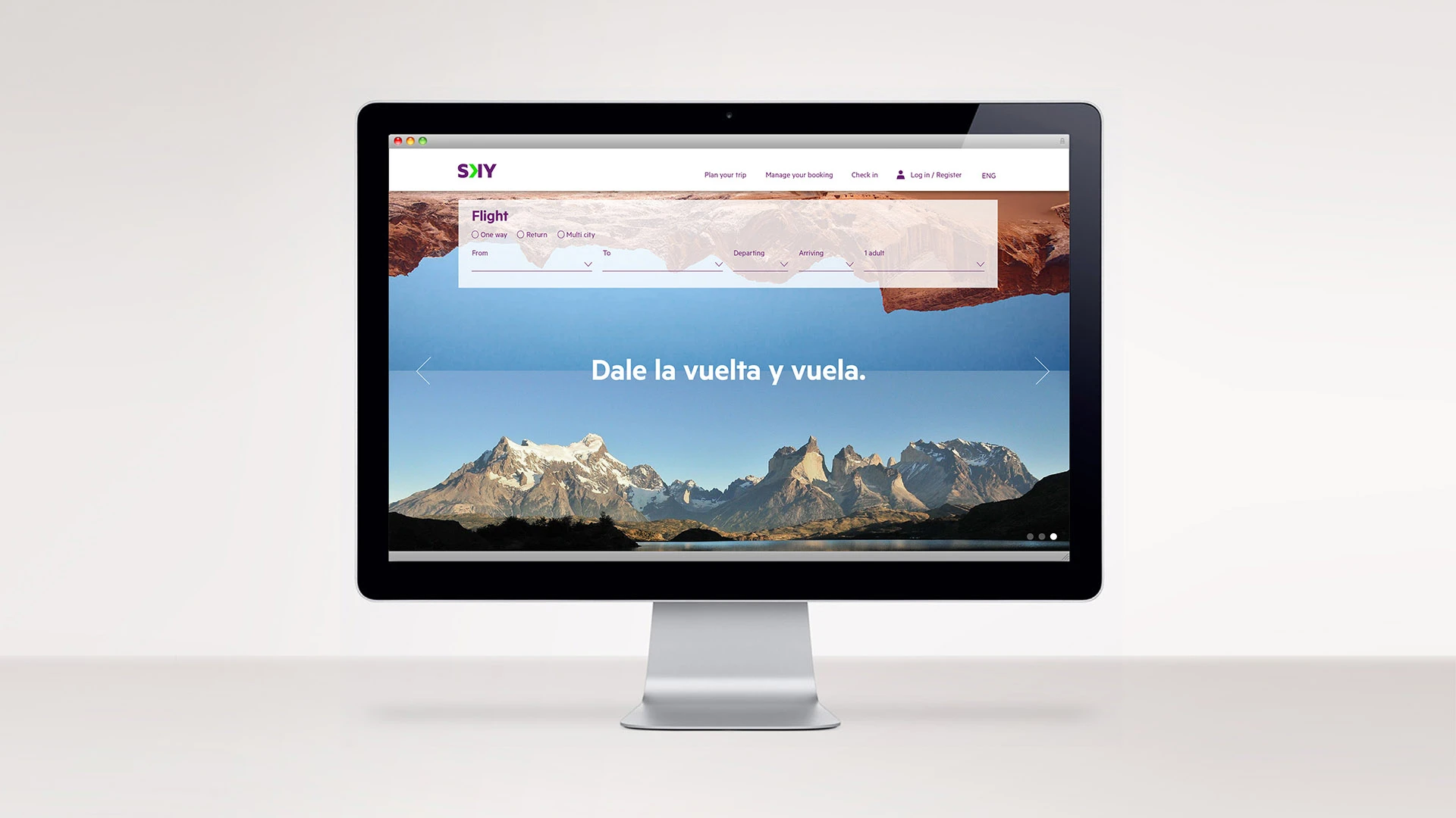
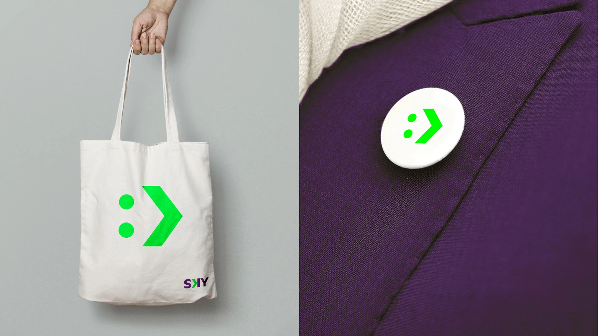
Different paths were explored through the various elements of the brand, in order to create a visual rhythm that would help SKY communicate not only at the time of its relaunch but also looking ahead to the future.
"It has been a pleasure working with Pan on the development of our brand. Throughout the process, they helped us project an innovative, modern, simple, and unique image in our industry, rooted deeply in our culture.
The Pan team became deeply involved with SKY and succeeded in winning over all our stakeholders."
